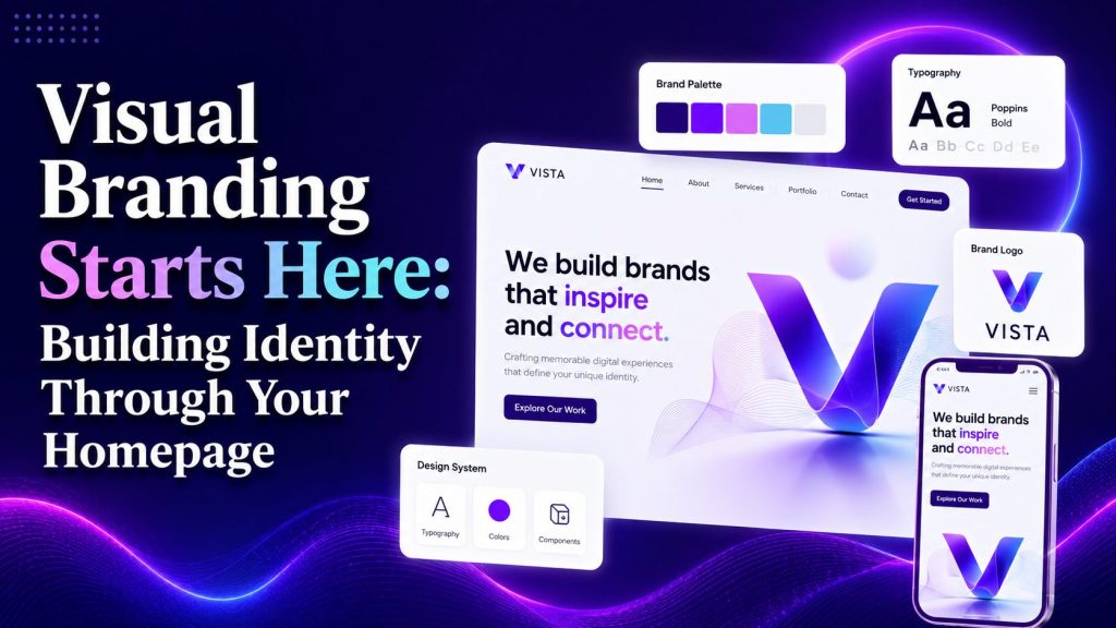
Your homepage cheats.
It tells people what to think about you before a single headline registers. Color temperature hits their gut. White space whispers about your confidence. Typography choices signal whether you’re playful or serious, contemporary or dated. All of it happens in a blink, beneath the conscious chatter.
We know dozens of brands that sabotage themselves in this regard. They treat visual identity like decoration. A logo slapped on a template. A hero image chosen because someone in marketing “liked the vibe.” The result lands flat because there’s no strategy underneath the style.
Real visual branding shows people who they’re dealing with when they hit this page. When you nail that, your colors stop being pretty and start pulling weight. Your layouts quit following conventions and begin directing attention where you actually want it.
Let’s pull back the curtain on exactly how that works.
Visual Demos Make Your Offer Instantly Clear
Your visitor showed up curious, not committed. The moment they wonder how your product/service actually works, you start losing them to the back button. A visual demonstration stops that clock cold.
Most homepages bury product mechanics in paragraphs nobody reads. However, when you replace explanation with demonstration, comprehension jumps and bounce rates drop. That’s because people don’t want to decode your offer. They want to see it functioning before they invest the mental energy to care.
To implement this:
- Pick the three or four actions that define your core experience.
- Strip each one down to a single, breathable sentence.
- Then pair it with imagery that does the heavy lifting. Screenshots, illustrations, or even simple iconography can work, but whatever you choose needs to show progression. Arrows, numbered steps, or a left-to-right flow signal sequence without you having to say “step one.”
- Keep the visual weight consistent across every stage so nothing feels like an afterthought.
Remember that you’re not doing this to win design awards. The goal is instant clarity. When someone lands on this section, they should grasp your process in under five seconds.
As an example, take a look at a brand that pulls this off beautifully. Scentbird is a fragrance subscription service. Their homepage features a three-step breakdown of how their model works.
Each step sits beside clean, minimal visuals that mirror the actual customer experience. There are no dense paragraphs or confusing jargon about fulfillment cycles. They simply show the flow. For a product people typically want to smell before buying, this visual sequence removes friction entirely.
The takeaway here is clear. Getting started takes zero effort, and the delight kicks in immediately.
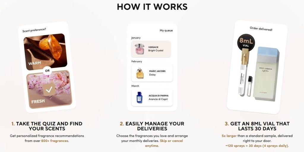
Source: scentbird.com
Videos Earn You Trust at a Glance
Static pages ask for belief. Video hands it over willingly.
When a visitor watches someone demonstrate a product, explain a process, or solve a problem on camera, skepticism softens. The exchange becomes human.
A staggering 96% of people have watched an explainer video to learn more about a product or service. That number tells you exactly where attention lives now. Your homepage can either adapt to that reality or compete against it. We recommend adapting aggressively.
To implement this:
- Decide what your video needs to conquer.
- Don’t attempt a company manifesto or a sweeping brand film for this placement.
- Focus on one friction point.
- Maybe installation intimidates your buyers. Maybe sizing confuses them. Maybe they can’t visualize your service in their actual life. Script around that single obstacle.
- Place the video prominently, above the fold if possible, and give it a thumbnail that signals clarity rather than empty polish.
- Captions are non-negotiable. Many viewers scroll with sound off, and you want your message to land either way.
Golf Cart Tire Supply, a niche supplier of golf cart tires and accessories, embeds this tactic smartly on their homepage. They feature a video explaining how one of their products works and how customers can incorporate it properly.
This has nothing to do with their company values or origin story. They just demonstrate practical usage for a specific audience that needs guidance. Someone shopping for tires or batteries for a golf cart likely has questions about fitment, performance, or proper installation. The video answers those questions before anxiety creeps in.
The result feels less like a sales pitch and more like a helpful conversation with someone who knows their craft.
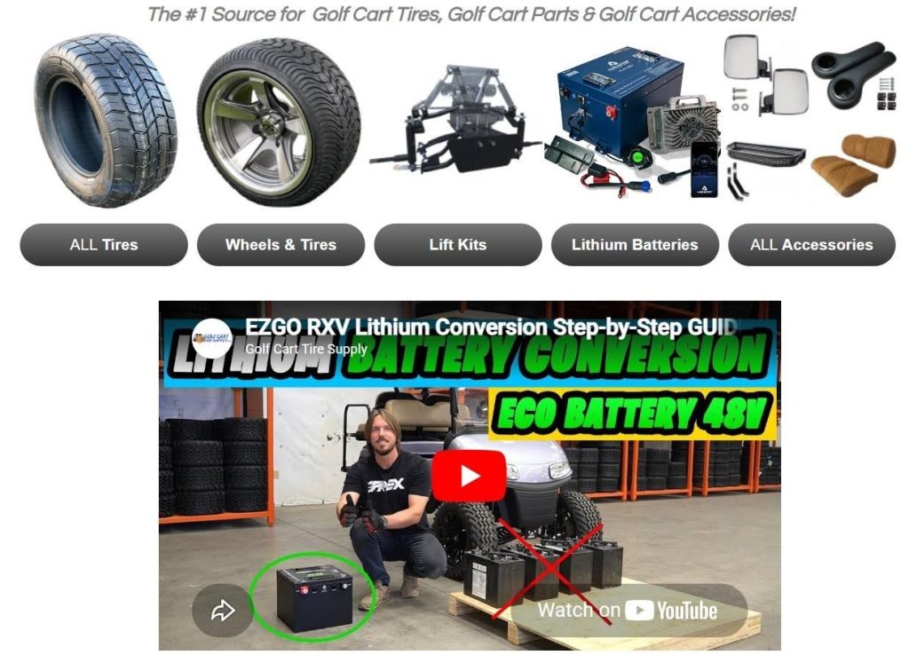
Source: golfcarttiresupply.com
Bold CTAs Lead the Next Move
Visitors aren’t actively hunting for action. They simply react to what grabs them. Your homepage can do everything right and still fail if the next step hides in plain sight.
We’ve watched eye-tracking studies and heat maps long enough to know one truth: The bolder your call-to-action, the faster the click. Pure contrast drives this, so increasing CTA button size alone can boost click-through rates by up to 90%. That figure should recalibrate how you think about button design entirely.
To implement this:
- Identify your primary action. Every homepage has one North Star conversion, whether that’s starting a trial, booking a call, or browsing products.
- Shape your hero CTA around that single goal.
- Secondary actions get secondary treatment, smaller or styled with less visual weight.
- Next, choose a color that doesn’t compete with the surrounding elements. When someone scrolls, that button should feel obviously clickable. White space around it matters as much as the button itself, so don’t crowd it with unnecessary stuff.
- Finally, write copy that matches intent. “Get Started” works much better than “Submit” because it reflects what the visitor actually wants to do.
Bay Alarm Medical, a medical alert systems provider, shows exactly how this pays off. Their homepage refuses to make you search for the next step. Their CTAs sit large and sharp, rendered in a signature soft-red that slices cleanly against neutral backgrounds.
Whether urging to “Take Product Quiz” or “See Plans,” each button pops immediately and mirrors the visitor’s likely intent.
People landing on this page need reassurance and speed. The buttons’ visibility delivers both, removing any friction between anxiety and action.
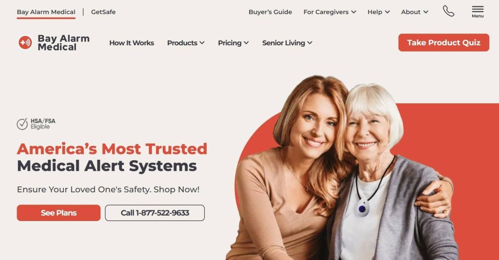
Source: bayalarmmedical.com
Real Faces Carry Your Credibility
Marketing claims bounce off, but peer proof sticks. When a potential customer sees someone they trust or relate to using your product, the wall between skepticism and desire crumbles faster than any headline could manage.
User-generated content works because it borrows authenticity you can’t manufacture. Your brand saying “we’re amazing” registers as noise. A real person showing themselves enjoying what you sell registers as evidence. Brands that consistently create authentic digital interactions tend to build stronger emotional connections with audiences across every platform.
The distinction matters enormously on a homepage where trust forms in seconds.
To implement this:
- Recognize the content formats that align with your product’s natural showcase. Unboxing clips, styling photos, before-and-after shots, and testimonial videos each tell different stories.
- Pick the format that answers your most common customer hesitation.
- Next, create a simple system for gathering material. Encourage customers to tag your brand, run a dedicated hashtag, or reach out directly to satisfied buyers for permission.
- Never fabricate enthusiasm. Authenticity fails the moment someone senses staging.
- When you receive strong submissions, place them prominently where credibility carries the most weight. Near pricing tables, above testimonials, or beside product descriptions all work well.
- Rotate content regularly so returning visitors encounter fresh proof. Many growing brands now rely on social media automation strategies to maintain consistent engagement while scaling their online presence.
Icecartel, a men’s moissanite jewelry brand, masters this tactic on their homepage. They feature images from celebrities and influencers unboxing and wearing their pieces.
The content here pulls triple duty. It serves as genuine testimonials from recognizable faces, showcases products in realistic settings instead of sterile studio shots, and builds demand through association as shoppers see influential figures choosing the brand. The tone throughout remains enthusiastic but natural, capturing true customer excitement rather than overproduced marketing polish.
For jewelry, where trust and perceived value drive every purchase, this social proof removes hesitation before it forms.
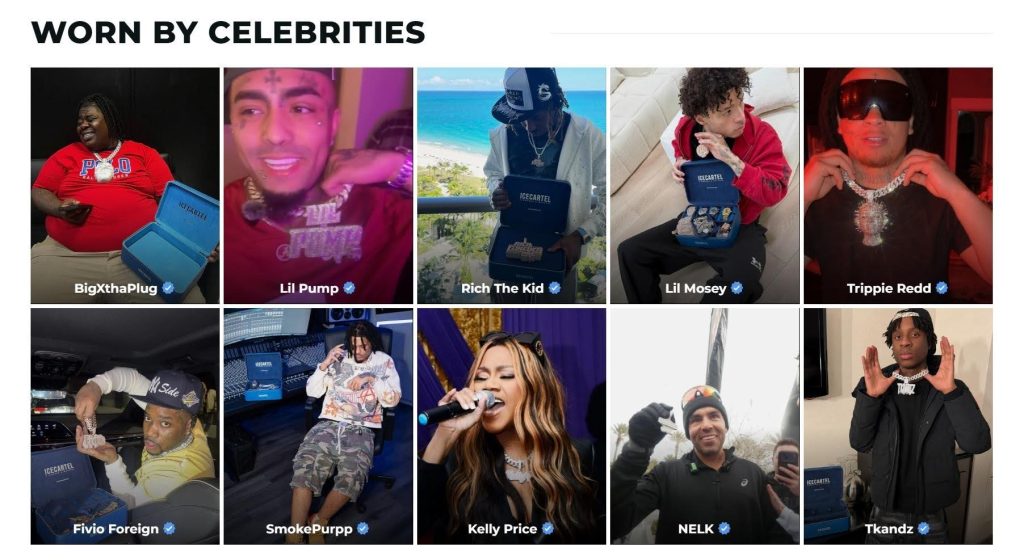 Source: icecartel.com
Intentional Space Commands Attention
While cluttered pages scream, quiet pages convince. When every element on your homepage fights for dominance, nothing wins. Your visitors’ attention scatters, and their trust follows right behind it.
White space is a directional tool that tells the eyes exactly where to land. Data backs this up consistently: sites with generous white space capture 35-45% more visual attention than layouts packed edge to edge with content. That’s a conversion lever sitting unused on most homepages we audit.
To implement this:
- Look at your current homepage and ask which elements would hurt your message if they disappeared.
- Remove anything that wouldn’t.
- Then apply breathing room systematically.
- Give your headline at least double the padding you think it needs.
- Separate sections with generous vertical gaps so each idea stands alone.
- Limit yourself to one focal point per screen height. When everything shouts, nothing gets heard, so pick the single element that deserves primacy in each scroll depth.
- White space also amplifies your CTA placement. If a button floats in enough surrounding emptiness, it becomes magnetically clickable without any flashy tricks required.
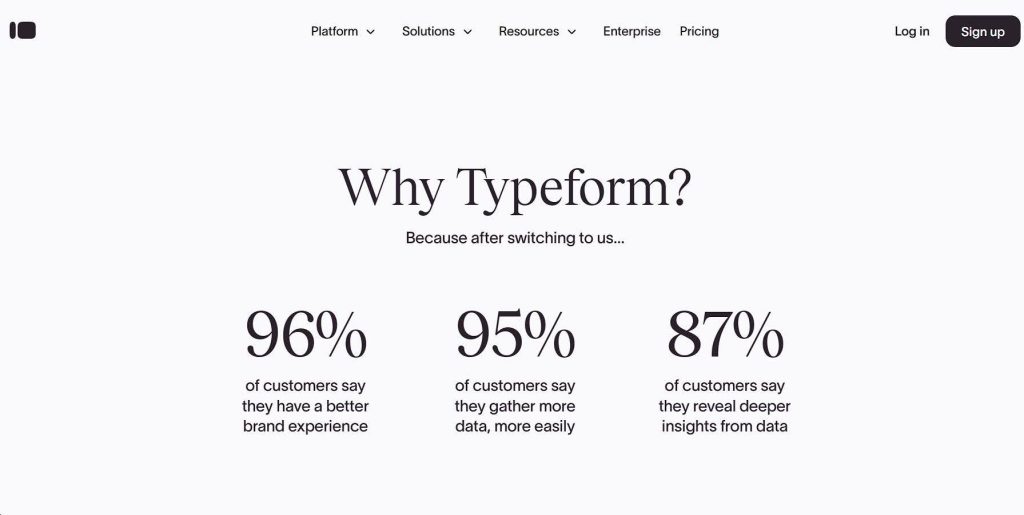
Typeform, a platform for building forms and surveys, demonstrates this discipline perfectly on their homepage. Their page never feels sparse or incomplete.
On the contrary, it feels intentional. Each section, whether presenting value propositions, breaking down features, or displaying social proof, occupies distinct territory without competition. Nothing fights for space because they refuse to overload the screen.
The outcome rewards both the brand and its visitors. People can actually read, comprehend, and act on what they see.
For a company selling clarity and ease of use, this allows their visual language to match their promise. Many modern brands are also combining minimalist homepage design with AI-powered visual identity tools to create faster and more cohesive branding systems.The breathing room becomes part of the product demonstration itself.
Source: typeform.com
Final Thoughts
Visual branding earns its keep when it stops performing and starts connecting.
Every tactic we’ve explored, whether it’s a product demo, an explainer video, a bold CTA, authentic customer content, or intentional white space, serves the same quiet purpose. They remove friction between curiosity and confidence. They close the gap between someone arriving and someone staying. As Agentic AI continues reshaping digital experiences, brands that prioritize clarity and human-centered design will remain easier to trust and remember.
Remember, your homepage has one job – to make people feel they’ve found the right place before they’ve read a single word. When your visuals pull that off, you know you’ve built something that genuinely converts.
So, pick your weakest spot and fix that first. Let your visitors’ clicks guide what comes next.
AI Agentic Platform For Building Portable AI Agents
Say Hello To Agentic AI That Connects With Your CRM And Even Other Agents