Chatbots are all the rage right now, and as a business, it’s essential you’re using them to improve communication with your customers. However, designing a chatbot that works well, or to the best of its ability, is no easy feat, and it takes time to create scenarios and find what works for you.
Think about the last chatbot you used.
Think about the buttons it had and the options it gave you. Did it give you the experience and information you were looking for, or did you feel left unsatisfied and want to take your business elsewhere?
If this is how your chatbot is making your customers feel, you could be missing out on a ton of potential customers and transactions, or you may be increasing the risk of miscommunication. With all this in mind, today we’re going to explore everything you need to know when it comes to making the best chatbot buttons possible.
Define Your Copy Length
While we talk about ‘copy length’ and ‘word count’ when referring to blog posts and articles, the same rule applies when writing chatbot content. Think about it; you’ve gone onto a website, something you’re interested in, and you have a question.
You click the chatbot and start clicking through the options and writing your question when suddenly you’re hit with a 400+ word paragraph describing a potential answer. What do you do? Well, if you’re like most other people, you’re probably going to skim read the content and leave not having taken any of it.
On the internet, nobody likes to read walls of text, so don’t give people that experience. The shorter your copy content, the better, or more accurately, the more concise and precise your content is, the better. You wouldn’t want to hear someone else go on and on about something, and your chatbot is exactly the same.
Always Highlight the Context
When you’re creating your chatbot buttons, it’s highly recommended that you always avoid using ‘yes’ or ‘no’ options. This is because people, as we said above, tend to skim-read everything on the internet, and their eyes will drop to the yes or no options, and they’re taking a guess. Yes, this really happens.
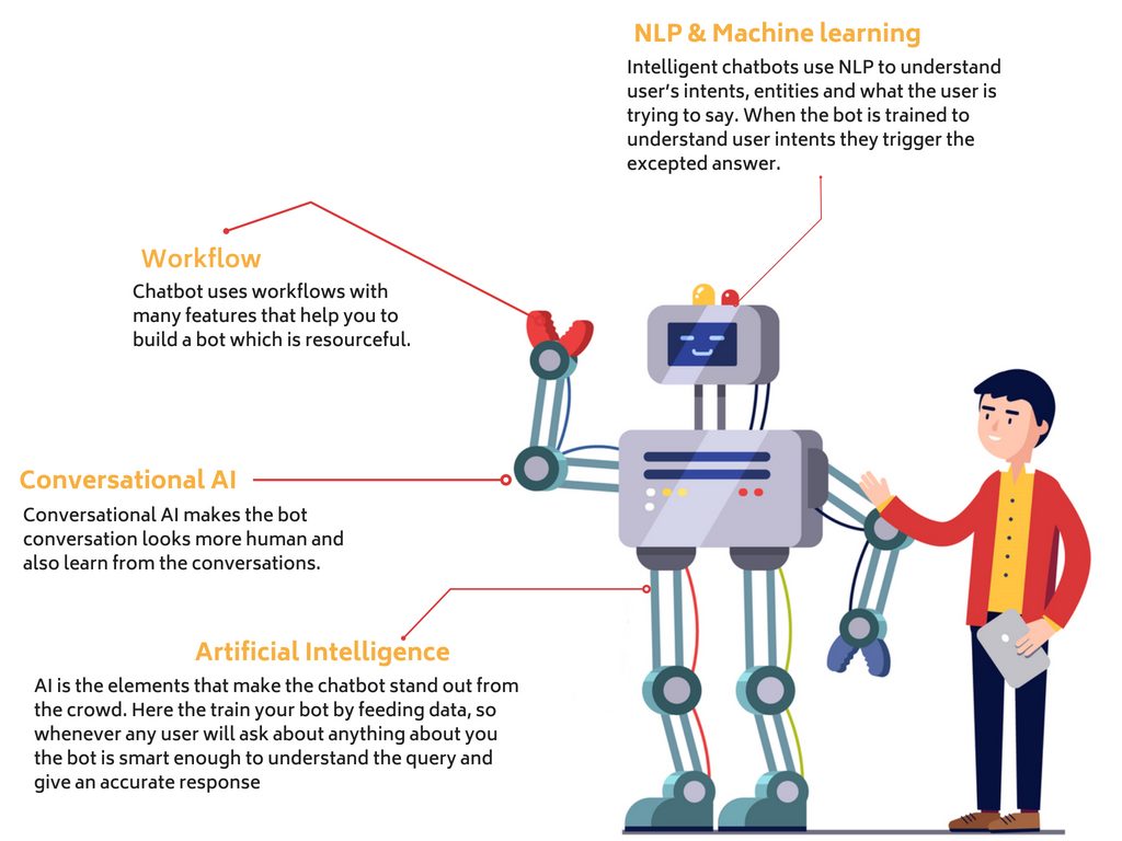
Source: DZone
If you’re working on a salon booking website, for example, you might say do you want to make a booking. Yes or no works fine, but adding context, you could write button answers like ‘I have a question’ or ‘I want to make a booking’. This gives customers a much more direct and contextual experience.
Choosing Your Chatbot’s Personality and Language
Yes, providing your customers with information is what people are there for, but you can easily take things one step further and make the experience far more fulfilling by creating a chatbot with personality and language.
Are you a professional, B2B business that’s smart and formal, or are you a casual, laid back business that likes to create a light and airy experience? Whichever you are, this branding and personality can be reflected in your chatbot.
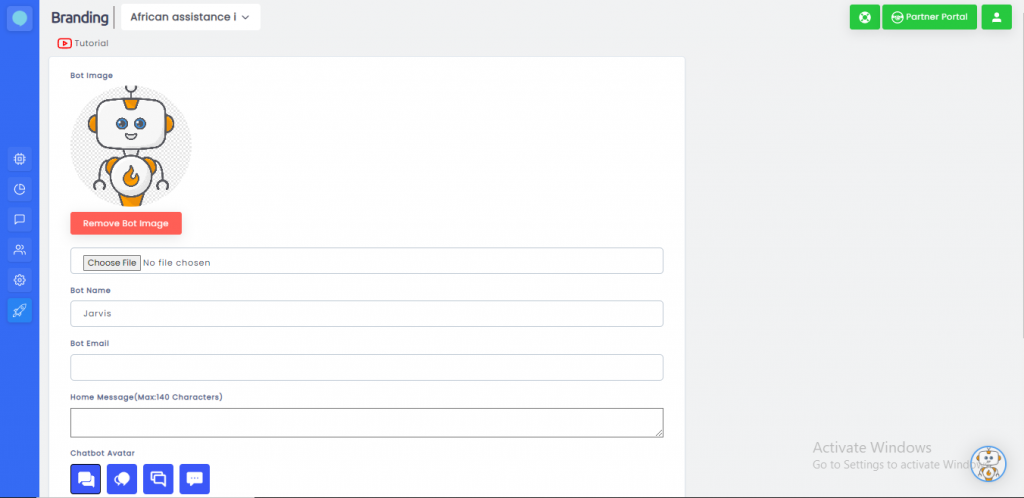
Take your time trying to find the right words and language to suit your chatbot that matches the experience your business already offers your customers. This way, it will be like they’re actually talking to someone in your business, and they’ll be far more connected to you and, therefore, far more likely to do business with you.
Telling People What Happens Next
“Even though text content is great for chatbot use, obviously, you don’t need to stop there. Remember when you used to call customer service phone lines, maybe your bank or car insurance provider, and you’re trying to listen to every option to figure out which is the best option for you?” explains Mark Harrison, a chatbot expert at Academized and UKWritings.
It’s the same with chatbots; people are still wondering about making sure that they’re pressing the right option for what they’re looking for. Make it easy for them. For example, if you’re offering the chance for someone to get in touch with you, and you simply offer a ‘call’ option, does this mean you’re going to start a phone call, video call, Skype call, just hand over the phone number?
A simple way to overcome this issue is to add emojis or other images, or just make your content clearer!
Providing a Number of Options
“Having too many options on your chatbot can actually be extremely counterproductive to guiding your customers because lots of choices can be overwhelming. Sure, you can offer a range of options, but trying to stick between 3 and 5 options will make people far more likely to proceed with using your feature,” shares Emma Austin, a tech writer at BigAssignments and EliteAss
It looks prominent!!
Creating your Menu Button
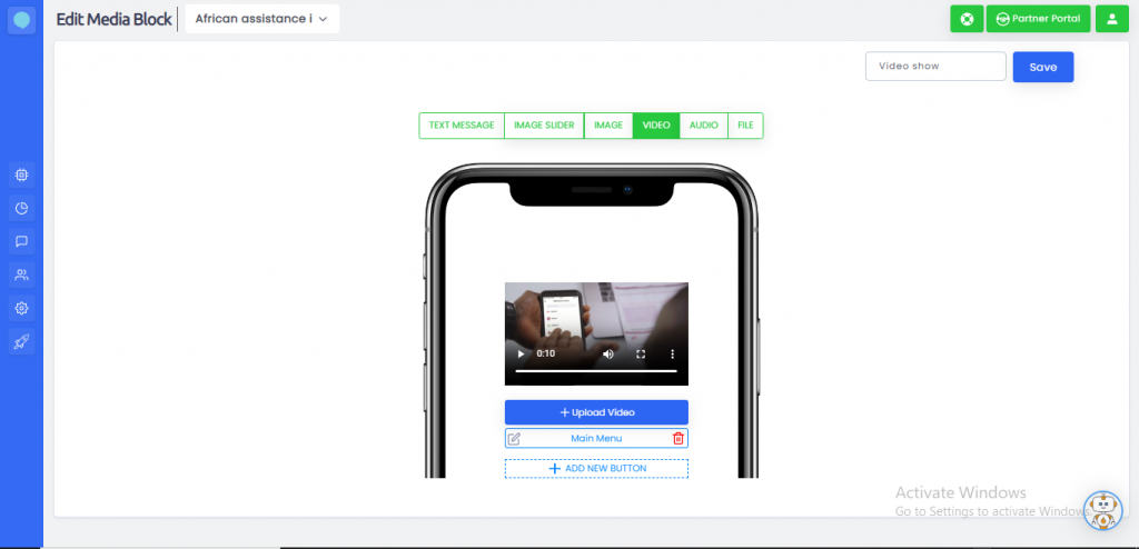
People make mistakes by mis-clicking or choosing the wrong option and don’t want to have to start from the beginning. Adding a menu button to show all options, or a ‘Skip’ button that allows people to fast forward to where they want to go can dramatically improve the experience you’re offering.
Look how Pizza ordering bot looks like.!!
Remember, using a chatbot is trying to improve your business to customer experience, so make it as easy and as beneficial as possible by using these features. This is how you make people love using your chatbot!
Making Your Button Fit Your Website
Finally, the last thing you want to check is actually making sure your chatbot buttons are on-brand with your website and your custom website image. Let’s imagine you’re using the Facebook Messenger chatbot. This is easy because around 90% of Messenger users will access the app on their phone, so you know the chances are you can optimise your button for mobile users.
This is referring to usability features and where you place the chatbot button on your website, by the way, and you can use usability tools to improve this.
However, if you’re using another service that people will be accessing on both websites, desktop, tablets, and mobile devices, you need to make sure your button is accurately placed and accessible to all users. You don’t want to look silly or overhang the page. Test using usability testing tools to make sure your buttons and chatbot match the kind of chatbot experience you’re trying to create.

