Since the onset of the global pandemic, all businesses were forced to go digital or die. On the plus side, customers can now reach you faster than ever. But on the negative side, your support team has been swamped with repetitive inquiries that are, frankly, wasting time.
This is what often inspires businesses to build their own chatbot. But hold your horses there. Chatbots aren’t a miracle solution either. Best case, they’ll free up employee resources and help convert visitors into customers. Worst case, visitors won’t want to engage with it and bounce off your website.
The wide disparity between good and bad chatbots comes down to one thing: UX design. While graphical user interface design is well-established, these best practices don’t always translate to chatbots. Remember, chatbots are dynamic systems that need to imitate humans somewhat to get the job done.
In this article, we’ll uncover the best UX practices for building user-friendly chatbots that engage your website visitors.
The Value of Chatbots
Chatbots are one of the most cutting-edge applications of Artificial Intelligence today, helping both users and businesses achieve their desired tasks in less time.
Chatbots help users by:
Improving response times
Helping users achieve their goals faster by making customer service more personalized, and available 24/7.
Decreasing mental load
Rather than directing users to a Help Center filled with countless articles to complete a simple task, chatbots can direct more impatient or less tech-savvy users through these steps in a fraction of the time.
Chatbots help businesses, on the other hand, by:
Increasing productivity
Freeing up employees from mundane tasks, so they can focus their energies elsewhere.
Lowering overhead
Decreasing business expenses due to not needing as large a support team to service customers.
Reducing bounce rates
If your business struggles with high website bounce rates, implementing a chatbot could help to engage new visitors with questions before they leave. Do keep in mind that this won’t solve the issue directly, as you’ll also need to implement user monitoring tools and perform A/B tests on your website design. But asking questions and getting direct answers from users will help to improve your understanding of their motivations, including why they clicked through to your site and whether they are actually interested in your offer.
Humanizing their brand
Many businesses come across as faceless corporations to their users. As a result of this, users might grow disengaged or even suspicious of the company in question. Chatbots can remedy this issue by providing a business with a unique voice and tone that users can engage with like they would a real person.
But before you dive head-first into building your chatbot, you need to make sure that it’s the right tool for the job.
Building Engaging Chatbots
Yes, chatbots are one of the many tools you can use to automate business processes. But does it make sense for your customers?
Here are two major cases in which users happily engage with chatbots:
- Executing a simple task quickly. For example, booking an appointment.
- Getting a piece of information that would’ve otherwise taken a while to find. For example, an answer that’s deeply hidden in the self-help portal.
The commonality among these two use cases is: saving time. So, a chatbot should save time for both your employees and your users. It’s this win-win scenario that will increase the chances of your chatbot being adopted.
Here’s another pro-tip for your business needs. Chatbots are used at the beginning of the sales funnel to answer any kind of questions from potential clients, right? Well, make sure that any requests are also integrated into your sales tracking software so that you can follow up with leads.
As an example of this, take a look at the marketing automation software ActiveCampaign’s live chatbox.
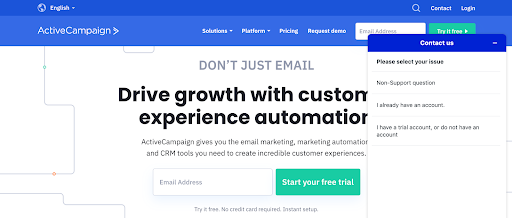
It doesn’t have any of the bells and whistles you’d typically associate with a chatbot, but you could nonetheless argue that it’s a chatbot. Why? Because it’s prompting you to enter an input in a natural language, which it then uses to perform a function (redirecting you to the right person).
As you can see, the lines are a bit blurry when it comes to distinguishing between what is or isn’t a chatbot. But forget the semantics and get creative with the use cases instead. You could, for example, use the conversation analytics from chatbots in your content planning process. In doing so, you’ll be able to create more personalized content that will address your audience’s most frequently asked questions.
When it’s all said and done though, all that matters is that you’re providing a better experience for the user. So with that out of the way, let’s dive into the top UX practices.
1. Manage the User’s Expectations
Chatbots create the illusion that they fully understand humans. These expectations can make or break the experience. For example, if the chatbot prompts the user to input a weekday, the user might do so in their natural language.
For example, the user might input “Monday” instead of 06/07/2021. Now, imagine the user’s frustration if they get an error message right after this input.
Let’s look at another example. If a user is trying to execute payment and the chatbot requires the currency formatting to be “$19.00” instead of “$19,” they should make that clear from the get-go.
A back-and-forth between a human and a chatbot can never be engaging if it’s riddled with errors.
2. Looks Matter for Chatbots
Humans rely on faces to understand and anticipate each other’s actions. This is so crucial to our ability to empathize that we even anthropomorphize inanimate objects.
Chatbots are no exception.
Many companies have chatbots that are face-less or represented by their logos. But this only alienates the user. Your best bet is to put a face to your chatbot. It could be a human, animal, or robot.
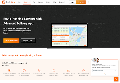
But you can never go wrong with adding a human face, like this route planning software is doing. Your visitors will then have the feeling of talking to a real person instead of a bot.
On the flip side, you could do away with the idea of giving your chatbot any character, and let it guide your website visitors to other humans instead. For example, in this in-depth Nextiva review, FastCall gives you the opportunity to talk to an expert through their chatbot.
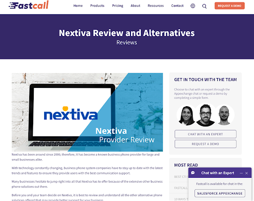
When you click through to Salesforce AppExchange and click on “Chat with us”, the chatbot will prompt you to enter your email before being connected with a member of the FastCall team.
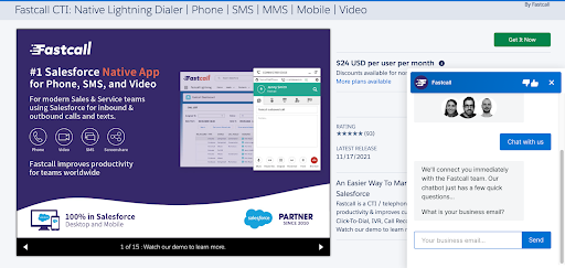
The key takeaway here is that if you can’t add personality to your chatbot, then there’s no need to fake it. Instead, use your chatbot as a straightforward middle man between the website visitor and your sales or support team.
3. Make the Chatbot Intuitive
When a customer starts speaking with your chatbot, no time should be wasted on learning how to use the chatbot itself. This ties into the first principle of managing expectations: don’t make the user guess.
Even something as simple as resetting the chatbot should be obvious. In traditional user interfaces, we have a home button. With chatbots, there’s no standard solution to this issue. But as an example, you could configure a keyword like “help” to present a list of general options like starting over. Or you could also have the chatbot ask whether to reset the conversation after a task was successfully completed.
A great idea to start the conversation with your customers is to ask directly for the email address in case anything goes wrong with the connection. This way, you’ll be able to reach out to them in a different way. An inspiration from this fireplace store:

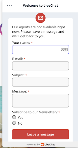
Whichever approach you choose, it shouldn’t be something the user has to think hard about. As an alternative to implementing all these complicated conversation flows, you can simply have your chatbot send the user’s information to your busy agents.
Richter Studios, a video production agency in Chicago, does this through a form on their website, which captures contact details from potential customers while the main staff are away.
4. Give the User Time to Read
One of the often-mentioned benefits of building chatbots is that you don’t have to spend time designing a graphical user interface. So what ends up being one of the most overlooked aspects of chatbot UX is the reading experience itself.
Chatbot UX may require fewer resources, but as you’ve no doubt seen throughout this article, there are still subtle ways to mess up the user experience. Just think about it: reading takes place on a screen, which means that it’s constrained by screen dimensions, which in turn, can become a problem depending on the:
- Font sizes
- Line spacing
- Message length
Since correcting the first two issues is simple enough, let’s focus on message length.
Every user reads at a different pace, some slower and some faster. But to err on the side of caution, your chatbot should give the user enough time to process each message before sending the next. It’s pretty distracting for the text to keep moving while you’re reading, all because the chatbot doesn’t pause between messages.
While there’s no set wait time, two or three seconds is a good baseline.
You should also keep in mind that the exact wait time should depend more on the length of the message. Hence, the shorter the message, the shorter the wait time.
Another good rule of thumb is to have no more than three lines per message. Aside from this, you can also program the chatbot to increase its wait time with each additional message.
One of the most insightful ways to test whether your chatbot is sending excessively long messages to users is to try your chatbot on different devices. If you find yourself having to scroll up just to read the entire message, then the message is in fact too long. A final point to keep in mind is that users often have their keyboards popped up on their mobile devices. This again hammers home the principle of making your chatbot’s messages as short as possible.
5. Choose Words Wisely
Traditional user interfaces are primarily visual. But the chatbot experience, on the other hand, is completely dictated by words. Here are a few wording principles every chatbot should follow.
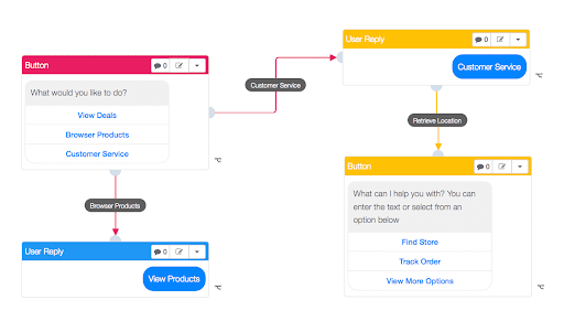
Be clear, not clever
This comprises two practices. First, don’t reinvent the linguistic wheel. Use the same words that your audience uses to describe things. Anything else will surely confuse.
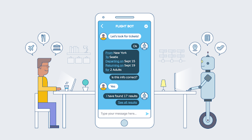
For example, in a flight booking scenario, use the terms “departure” and “return” rather than “inbound” and “outbound.” Second, keep your sentences at a sixth-grade reading level.
Confirm by asking
A good chatbot will be able to take into account the various nuances of English grammar and still serve customers who don’t speak English as their first language. But no matter how well-designed, errors are an unavoidable part of the chatbot experience. How errors are corrected makes all the difference.
For example, if Alice states that she wants to send a payment to Bob, the chatbot should confirm this by asking something like, “Send this payment to Bob?” That way, in the event of an error, the user can easily deny this action.
The question determines the response
Two otherwise identical questions, worded in slightly different ways, could result in different answers. To optimize for error avoidance, pay careful attention to words such as: “who,” “what,” “when,” and “where.”
Continuing from the last example, if the chatbot prompted Alice with “Who do you want to send your payment to?” she will probably answer with a person. But if the chatbot were to ask, “Where do you want to send this payment?” she might think to answer with a location instead.
Getting Your Chatbot Adopted
As we approach 2022, Artificial Intelligence will continue to pervade every aspect of our personal and professional lives.
The key, however, to getting your chatbot adopted by users is to make them as easy to talk to as a support agent. So mind these tips as you build your bot. If you’re still struggling to implement UX best practices into your chatbot, taking a course might help. Masterclass has several interesting courses on UX design and how to optimize your site for a better user experience.

