On average, pop-ups have a conversion rate of 3.09%, but those that do it right can achieve as much as 10%. In addition, studies indicate that pop-ups can increase your conversion by as much as 60% when used correctly.
Now, not all people have something to sell. So, despite the absence of a product, pop-ups are excellent ways to get the email address of your site visitors.
Today, we will show you seven ways by which you can create an exit pop-up that converts. In the end, we are confident that you will have the proper guidance on how to execute pop-ups on your website.
What Exactly Is An Exit-Intent Pop-up?
An exit pop-up is a window that appears on a webpage. The assumption is that a person who visited your page will leave early. Before he does so, you want to show him a reminder.
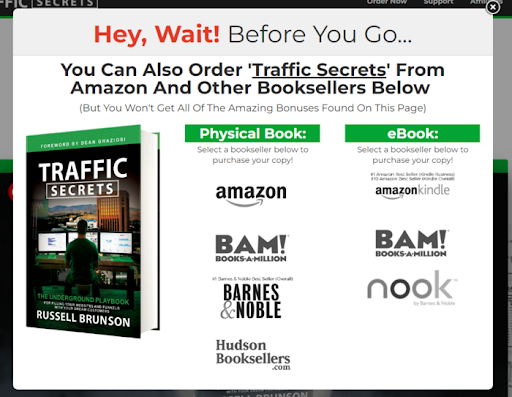
Below is an example of an exit-intent pop-up:
As the term implies, the pop-up appears when the user intends to leave. The thing is, nobody knows when this intent is going to happen.
Only the website owner can say when a user is about to exit. Below are some likely exit parameters:
- When the person has reached the end of the page
- When a few seconds have passed
- When a site visitor clicks on something on the website
These three reasons are complicated to determine accurately. First, you need to conduct statistical studies to determine how soon the site visitor will leave a page. Since studies like this are costly, you want to use automation tools to drive down your costs.
The purpose of an exit-intent pop-up is to get something from a user. Many people who joined the best affiliate programs use pop-ups to make a sale or get email addresses.
For example, the exit pop-up may contain a coupon code, a discounted and bundled product, or a freebie if you are operating an eCommerce store.
An exit-intent pop-up usually refers to an email subscription window for bloggers. The site visitor gets a free lead magnet, like an eBook.
How To Create An Exit-Intent Pop-Up?
Below are some ways by which you can increase your exit-intent pop-up conversion rates.
1. Don’t Neglect The Design
The design of the pop-up is critical to its success. If it is messy, it looks unprofessional. The site visitor is not going to like it. Some may not even know what it is for.
The last thing that you want is to make the pop-up look like an ad. At the very least, you want the pop-up to carry the same color scheme as your website.
Here are some best practices to consider:
- Button color – make it different from the background and text; it has to “pop” or shine
- Images – an image says a thousand words; if you are giving away a free eBook, show it
- Customize the button text – do not just say “get it now” or “sign-up” here. These CTAs are cliché. Instead, use CTAs like “Get Your FREE Personal Assessment.”
Take a look at the exit-intent pop below:
You will see that the color scheme of the button matches the book. It also has an image. More importantly, the icons of the online stores are the actual links—they are not words that say, “Buy now!” Instead, the user has to click the icons where he wants to get the book.
2. Make Irresistible Copy
Conversion is about persuasion. If your copy is not convincing enough, no design will increase your conversion rate. Copy is nothing more than the text that persuades the person to take action. Below are some tried and tested fundamentals of copywriting.
Appeal to emotion
People do not buy because they need something. They buy things because they got persuaded to do so. It is the reason people buy oven toasters that they do not need. Some buy home decors that they have no use for.
Why? Because the Wikipedia page creation services did a good job.
If you want people to take action, use words that appeal to feelings, not intellect. For example, say “Live a happy life” instead of “buy this house.” Happiness is an emotion, but buying is not.
Focus on benefits, not features
One common error in copywriting is that the writer uses too many words on features. Buyers do not want features. They want to know how the product or service will benefit them.
For example, no one cares if the lithium battery is 10,000 mAh. Instead of writing 10,000 mAH, you should say, “lasts for 48 hours on standby and 6 hours for video playtime.” That benefit is much more convincing than regurgitating features because consumers have concerns about the battery on their device and want concrete numbers.
Make use of FOMO
Fear of missing out or FOMO is a vital component of a copy. In human history, there is always a shortage of resources. Therefore, it is part of human psychology to fear scarcity.
To make an irresistible copy, use urgency. For example, make your offer available only for the next 48 hours or only for the first 100 people.
Use a compelling CTA
The last advice we have for a copy that converts is a good CTA. We touched on this subject earlier, but we just want to reinforce it. A good CTA is not cliché.
Use words that imply benefit. Here are some examples:
- Learn how to be a millionaire now
- Uncover the secrets of marketing
- Become a master of…
- Yes, I want to learn now.
These CTAs appeal to emotion, and they also focus on benefits. More importantly, they show the user the value of the product or the service.
3. Personalize By Page’s Content
Do not use the same pop-up on all your pages. There is a reason your site visitor is on a specific page on your website, and that reason is the content.
For example, offering a guide on the cost of owning a dog does not make sense if the page is about a list of dog feeders. In this case, you are better off getting the email address in exchange for a list of 101 feeders to buy for a dog.
The content of your page is the key to a successful conversion. If you do not have an offer, an alternative is to use AI chatbots to converse with your site visitor. From here, you can gather data and create a more meaningful offer.
4. Prepare A Quiz As An Exit Pop Up
Quizzes are interesting, so they are excellent for engagement. The thing with quizzes is that your site visitors do not look for them. So, a pop-up quiz is a perfect solution.
It is a win-win situation—they get to know something about themselves, and you get their email addresses. Just make sure that when you use a quiz, do not do a survey.
Instead, the quiz must promise to reveal something about the site visitor. Here are some examples:
- What kind of worker are you?
- Find out the best make-up for you
- Are you a beginner or an expert?
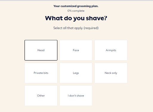
Take a look at the example below from Dollar Shave:
It is not exactly a pop-up but part of a funnel. At the end of this quiz, the system recommends products for the site user to buy based on his answers.
In a quiz pop-up, you ask your site visitor several questions, which all boil down to a result about themselves. It is enough to arouse their curiosity. However, they will not get the result unless they sign up.
5. Run An A/B Test
Before running an A/B test, you need AI technology for marketing. Many email subscription software programs like MailChimp already have this.
A/B tests are crucial to marketing. In it, you create and launch two versions of your exit-intent pop-up. Then, after a while, you measure which of these two versions works better.
You can create varied versions. For example, these two versions have the same copy but different color schemes. You can also use different button CTAs. Another choice is to compare one with an image while the other is just text.
Before you invest, you must review the best email service providers. Unfortunately, not all have the same prices and offerings, so take your time.
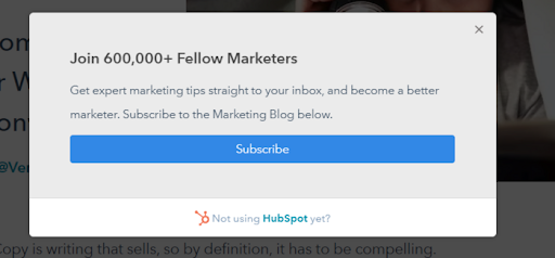
6. Give A Yes/No Choice
Another method to increase your conversion is to provide clear options. These options should be clear, and the reader must know what these options mean.
Below is an example where a reader has a choice:

The main idea here is transparency. Giving your site visitor a choice puts him in control. One folly that some marketers make is forcing the reader to sign up. In our opinion, there is nothing worse than that approach as far as losing traffic is concerned.
7. Don’t Be Annoying
The last piece of advice we have is to respect your site visitors. Although this may sound explanatory, some marketers are just too “pushy.”
Show the pop-up only once. If you make it appear several times, you negatively impact the user experience. Instead of the site visitor trusting you, he gets annoyed and would leave!
Bonus Tip: Let Them Quit (If They Want To)
For the life of you, do not annoy your users with a pop-up that they cannot remove quit. The pop-up must have an X button that is easy to locate.
You see, people went to your site because they need information. They did not go there to see marketing stuff. You already did an excellent job with your SEO—you have traffic; why waste it with a lousy pop-up, right?
Make your pop-up easy to quit. But then, add the pop-up content at the bottom of your pages, too. That way, the user can register if they want or change their mind.
Do Exit Pop-ups Work?
Yes, pop-ups work. Companies like OptinMonster have data to prove this claim. For example, they recovered 53% of abandoned carts with exit-intent pop-ups. In addition, some companies like Medstar Media increased conversion rates by 500% with pop-ups.
While pundits say that pop-ups can be annoying, it all boils down to proper timing. The design of your pop-up and your copy are also key factors to your success. To get the most of exit intent pop-ups, design them for the reader, not for you.