


Online stores are often like leaky buckets. They get a flood of visitors clicking through, browsing, and then evaporating. We find that moment endlessly fascinating. Frustrating, sure, but fascinating. Because the store itself usually holds the answer.
After auditing hundreds of ecommerce sites, we’ve learned that nobody wakes up thinking, “I’d love to be impressed by unfounded claims today.” Yet we keep building stores that are overly demanding. We bury trust, hide thousands of products behind layers of pages, and force aggressive CTAs.
Your visitors don’t appreciate that. The moment your store asks them to work, they remember they could be watching cat videos instead.
We wrote this piece because most UX advice sounds like a refrigerator manual. Sterile and forgettable. We’d rather give you principles you’ll actually recall while tweaking your product page at midnight.
Let’s dig in.
Clean Layouts Keep Buyers Focused
We’ve watched visitors land on a cluttered store page and do the exact same thing we do in a packed, noisy restaurant – turn around and leave.
Your store’s visual design triggers snap judgments that take about 50 milliseconds. Blink, and it’s over. A clean layout signals competence, respect, and reliability before a single word loads.
When we talk about “uncluttered design,” we’re not advocating for emptiness. We’re talking about intentional arrangement where every element earns its place and nothing competes for attention.
Here’s how to pull this off:
- Evaluate your website with a ruthless eye. Ask yourself what you can remove without losing meaning.
- Strip out decorative banners, excessive color palettes, and competing CTAs.
- Then, establish a consistent grid system and stick to it religiously. When sections share the same column width, alignment, and spacing, visitors unconsciously relax.
- Pair that restraint with generous whitespace around your “Add to Cart” buttons and key trust signals.
- Limit your font styles to two (one for headings, one for body text) and use size and weight, not decoration, to establish hierarchy.
- Let your product photography breathe on clean backgrounds that mirror your site’s canvas.
That philosophy plays out beautifully on Pergola Kits USA, a brand selling ready-to-assemble pergola and pavilion kits for homeowners tackling outdoor upgrades.
Their homepage opens with a crisp grid of product categories, each framed identically against a white backdrop. Next comes a row of circular trust badges, followed by concise text blocks and a single prominent CTA guiding visitors naturally forward.
There are no pop-ups, no scrolling carousels, and no visual noise whatsoever. The browsing experience simply mirrors the calm confidence they want you to feel about assembling their product.
By refusing to overdecorate, Pergola Kits USA lets its value proposition stand unchallenged.
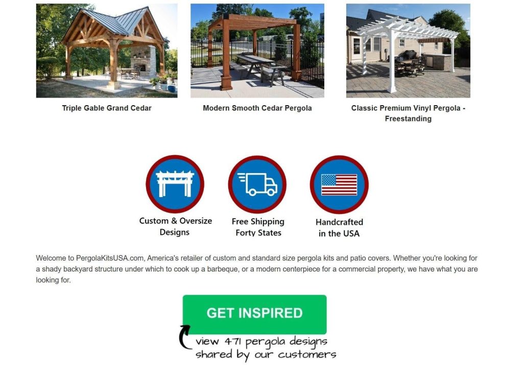

Source: pergolakitsusa.com
Trust Signals Remove Buyer Hesitation
Skepticism is the default operating system for online shoppers. We all carry it. Every visitor arrives quietly, wondering why they should believe you. Your product descriptions and guarantees can only carry you so far because, naturally, you’re biased. Your customers aren’t.
A product backed by reviews shows a 270% higher purchase likelihood than one without. That statistic reflects a simple truth that strangers trust other strangers more than they’ll ever trust a brand’s own claims.
Implementation starts with gathering proof strategically, not passively:
- Stop waiting for reviews to trickle in. Create a post-purchase email sequence that arrives when excitement peaks (usually three to seven days after delivery).
- Ask specific questions like “What surprised you most about this product?” instead of a generic “Leave a review.”
- Then, display that feedback prominently on product pages, not buried on a separate testimonials page nobody visits.
- Photographic evidence matters enormously. Encourage customers to submit photos with their reviews and showcase those images near your “Add to Cart” button.
- For extra credibility, link to the reviewer’s social profile whenever they consent.
- Video testimonials, even short clips shot on phones, convert even better because they can’t be faked.
- Also, aggregate your numbers. A running count of total customers served, products sold, or average star rating gives hesitant buyers permission to join the crowd.
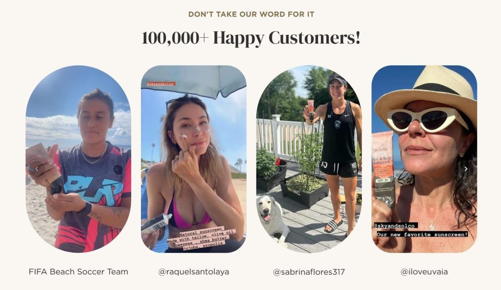
Sky and Sol, a brand crafting natural skincare products from tallow and simple botanicals, nails this principle. Their site features a declaration of over 100,000 happy customers right where it catches your eye.
But they don’t stop at the number. They display real customer photos (actual faces, unfiltered skin, and genuine smiles) and tag each person’s social media profile. That tagging transforms abstract proof into verifiable truth. Click a profile, and you’ll find a real human, not a stock model.
For skincare shoppers who fear empty promises in pretty bottles, this approach dismantles hesitation. The brand doesn’t ask you to believe. They simply introduce you to people who already do.

Predictive Search Shortens the Buying Journey
Typing a query into a sluggish or imprecise search bar feels like shouting into an empty room. Your customer knows what they want (often with surprising specificity), but a weak search tool forces them to browse longer. That friction costs you sales. Stores that prioritize content-driven UX strategies often make product discovery easier by helping users understand choices faster and with less effort.
When your search function predicts your customers’ needs mid-keystroke, you transform from a store they have to navigate into one that seems to understand them.
You can pull this off by starting with the placement itself:
- Move your search bar out of some cramped corner and center it prominently in your navigation, making it visible on every page.
- Enable predictive search that populates live results as users type, pulling not just product names but also categories, resources, and related terms.
- Your algorithm should account for common misspellings and synonyms. A customer searching “men swim” should still land on swimwear for men.
- Include thumbnail images in the dropdown results whenever possible. Visual confirmation speeds decision-making.
- Tag your results by type so users can instantly distinguish between products, guides, and accessories without having to click through.
- Also, track your search analytics religiously. Queries that return zero results reveal exactly what customers want that you haven’t yet provided.
Sewing Parts Online, a retailer selling sewing machines, replacement parts, and craft supplies, demonstrates search done right. Their search bar commands immediate attention, placed centrally within the navigation where eyes naturally land.
Start typing “embroidery,” and before you finish the word, a dropdown populates with categorized suggestions, such as embroidery units, machines, learning resources, and kits. A customer who might’ve guessed the wrong product name still arrives at the right destination.
This approach respects the practical, task-oriented mindset that sewing enthusiasts bring to the site. When you’re hunting for a specific bobbin case or presser foot, predictive accuracy is the difference between a completed purchase and a tab closed in frustration.
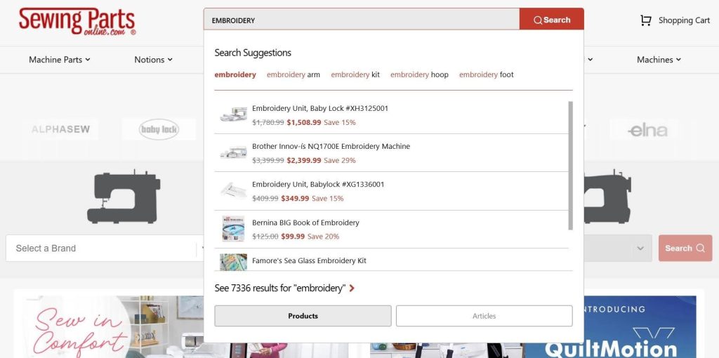

Source: sewingpartsonline.com
Guided Personalization Feels Useful
Modern buyers have grown to expect personalized shopping experiences. When you tailor their journeys to individual preferences, you signal that you see your customer as a person, not a transaction.
The data backs this up: 37% of shoppers buy more often when stores serve personalized product recommendations. Generic storefronts breed generic results. Relevance closes the gap between browsing and buying. The same UX principles that improve ecommerce personalization are also shaping how brands design more engaging chatbot experiences for customer interaction.
Here’s how to personalize without feeling invasive or gimmicky:
- Create a short quiz that asks practical, need-based questions and routes visitors to specific products.
- Keep it brief. Three to five questions work best before attention frays.
- Use visuals alongside each option so decisions feel intuitive rather than analytical, especially as more ecommerce brands experiment with tools like an AI Avatar generator to create interactive and personalized shopping experiences.
- Behind the scenes, tag every product with attributes that map to quiz answers, ensuring recommendations actually match the stated need.
- Beyond quizzes, activate personalized sections like “Recently Viewed” and “You Might Also Like” based on browsing behavior.
- Trigger post-purchase follow-ups that suggest complementary items tied to what they just bought.
Drift, a brand specializing in car and home air fresheners, embeds this tactic right into their homepage with a discovery quiz that feels effortless.
The first prompt makes visitors choose between their car and their home. From there, the quiz narrows preferences through short, visual prompts (scent intensity, aesthetic style, placement, etc.), leading each visitor to a curated recommendation in under a minute. Scrolling through endless product grids is completely eliminated.
This way of distilling their entire catalog into a few friendly questions allows Drift to turn what could feel like a mundane commodity purchase into a personalized, almost consultative experience. The quiz builds confidence that the product belongs in the buyer’s life.
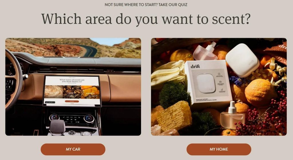

Source: drift.co
Mobile Seamlessness Inspires Fast Decisions
Your customer swipes through your store while waiting for coffee, standing in an elevator, or pretending to listen during a meeting. That’s the primary way people shop now.
Mobile commerce commands over 60% of ecommerce traffic, yet we still encounter stores that treat the small screen as an afterthought. A pinched, squinting, zoom-in-zoom-out experience annoys people and erodes the perception of quality. It sends shoppers straight to competitors who bothered to get mobile right. As conversational interfaces become more common across ecommerce platforms, intuitive UX/UI design is becoming just as important for AI-powered customer interactions.
Here’s how to pull this off:
- On mobile, every pixel demands justification. Collapse secondary navigation behind a clean hamburger menu so products dominate the viewport.
- Design your CTAs for thumb zones. Place primary buttons in the screen’s lower half where one-handed tapping feels natural.
- Test your buttons for size. 44 by 44 pixels should be the minimum, or you’re inviting mis-taps and frustration.
- Compress your images aggressively while maintaining crisp resolution because sluggish load times kill mobile conversions stone dead.
- Streamline your checkout to autofill wherever possible, and offer digital wallets like Apple Pay and Google Pay to slash typing entirely.
- Test your store on actual devices, not just browser emulators. Hold the phone and tap through your own flow. Feel every hesitation.
A luxury womenswear brand, Retrofête, delivers a mobile experience that matches the caliber of their garments.
Their mobile site opens with an uncluttered interface where collapsible secondary sections step aside, letting products and essential details command full attention. Navigation flows intuitively without overcrowding the viewport. Images load crisp and fast, and CTAs sit exactly where thumbs expect them.
This shows that the brand understands that their clientele expects refinement at every touchpoint. The mobile shopping experience reinforces the same premium sensibility that their clothing projects.
When someone is commuting to work and deciding whether an expensive dress belongs in their cart, that alignment between digital experience and product quality tips the scales.
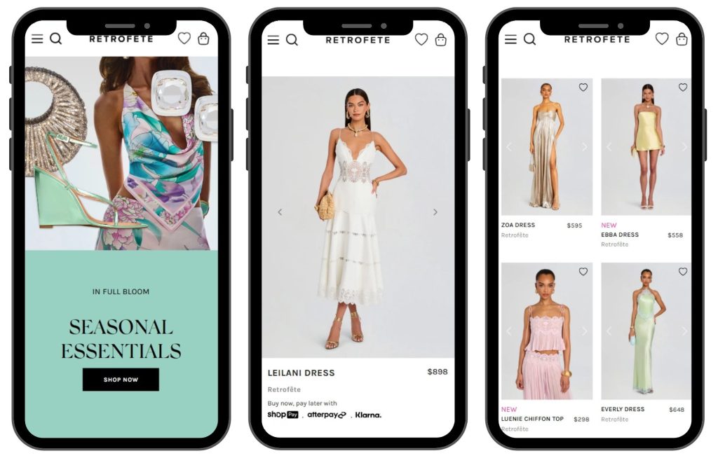

Source: retrofete.com
Final Thoughts
We’ve walked through five principles – clean design that calms, social proof that persuades, search that predicts, personalization that guides, and mobile experiences that respect the thumb.
None of them demand a complete rebuild, while all reward small, deliberate changes. So, pick one principle and audit your store through that lens this week. As Agentic AI continues influencing ecommerce experiences, brands that simplify decision-making through thoughtful UX will gain a stronger competitive edge.
Your visitors already arrive with their wallets mentally half-open. Your job is simply to stop giving them reasons to close them.
AI Agentic Platform For Building Portable AI Agents
Say Hello To Agentic AI That Connects With Your CRM And Even Other Agents