


Every click on a platform begins with a small question in the user’s mind. What does this site offer?
The interface presents options, but the content explains them. Labels, instructions, headings, and short bits of guidance shape how people read a page and decide their next step.
Content-driven UX treats language as a core part of the user experience (or customer experience). Brands plan the message, structure, and clarity of information alongside layout and navigation. Each piece of text supports a task, answers a question, or removes doubt during a user’s journey.
This approach changes how platforms communicate. Pages become easier to scan, and actions feel clearer. As a result, users spend less time figuring out the interface and more time completing what they came to do.
The post breaks down practical ways to apply content-driven UX across websites, apps, and digital platforms.
Lead with the Core Value
Users decide fast whether a page deserves their attention. The opening message carries heavy responsibility. A clear value proposition tells visitors what the platform offers, who it serves, and why the offer matters, especially for businesses like a white label AI agency that must clearly communicate their offering to partners and clients.
UX places that message at the top of the experience so users understand the purpose of the page within seconds.
Research on long-term brand performance shows the impact of strong positioning. Companies with a clear and consistent value proposition record about 76% more growth across a ten-year period.
A message that aligns product benefits, audience needs, and platform structure lets users immediately know whether the platform can solve their problem.
Teams can build this clarity with a few practical steps:
- Write one direct sentence that explains the main benefit of the product or service.
- Place the user outcome in that sentence.
- Avoid internal language and technical jargon.
- Position the value proposition in the most visible area of the page, usually the hero section.
- Support it with short proof points such as features, results, or integrations.
- Review navigation labels and CTA text so they repeat the same promise. Consistent wording helps users confirm they are in the right place.
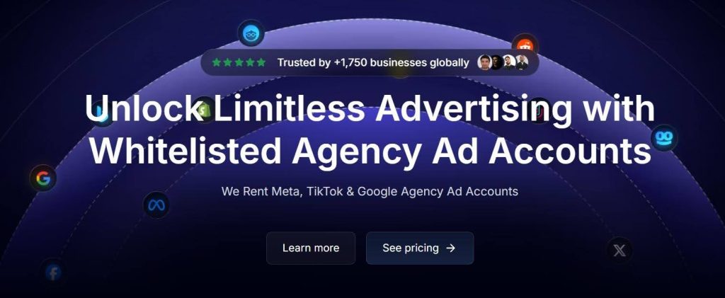
One example of this appears on the homepage of Uproas, a company that provides premium agency advertising accounts for platforms such as Meta, Google, and TikTok.
The first thing visitors see sits in the center of the header and states, “Unlock Limitless Advertising with Whitelisted Agency Ad Accounts.” The message states the offer and the benefit in plain language. This gives visitors an understanding of the service before they scroll.
This clarity helps the platform attract marketers who need a stable advertising infrastructure.

Make the Invisible Visible
When users can’t quickly figure out how something works, they don’t bother asking questions. They just leave.
A process that lives inside dense copy or buried FAQ pages might as well not exist. If you want users to take action, show them the path first.
This is especially true for platforms offering services that are unfamiliar or involve multiple stages, such as an AI agent builder where users need clear guidance through setup and automation flows. The more moving parts there are, the more a simple visual breakdown earns its place on the page.
Teams can apply this approach with a structured method.
- Map the main action you want users to complete.
- Break that journey into the smallest meaningful stages. Most platforms can explain their process in three to five steps.
- Write a short headline for each step and keep the description under two sentences.
- Pair every step with a small visual element such as an icon or illustration. This visual cue helps users scan the sequence quickly.
- Position the step sequence near the top of the page or directly after the value proposition. The steps should appear before users reach detailed product information. This order builds confidence early.
- Review the wording carefully. Each step should focus on a user action, not an internal system process.
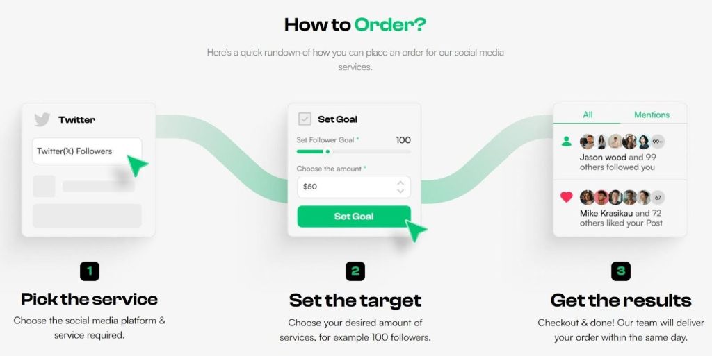
Socialplug, a marketplace where users can buy engagement across social media platforms (followers, likes, views, or comments), applies this well.
Their homepage walks visitors through the ordering process in three steps, each paired with a small illustration and a short description. You’ll choose a service, define your target, and check out. That’s it.
The layout is clean, the copy doesn’t overstay its welcome, and by the end of those three steps, users already know exactly what to expect. The friction is gone before it starts.

Let Proof Do the Talking
Visitors often search for proof before they trust a platform, particularly when evaluating services from an AI agent agency or other specialized providers. They want to see results, real clients, and practical outcomes.
Long case studies provide that evidence, but placing full reports on a homepage creates clutter. Compact excerpts solve this problem. They present the key message of a success story while keeping the page easy to scan.
Content-driven UX treats these excerpts as structured content blocks. Each block summarizes the problem, the action taken, and the result. This format gives readers quick evidence that the service works. Visitors who want more detail can open the full case study through a clear CTA.
Teams can implement this tactic with a simple framework:
- Select your strongest case studies. Choose examples that reflect common customer problems.
- Write a short summary for each story. Use three short parts: the client challenge, the solution your team provided, and the measurable result.
- Keep the language direct and easy to scan.
- Design also plays an important role, so place each excerpt inside a clear visual container.
- Add a short headline that highlights the outcome.
- Include a small statistic or result if possible.
- Link each excerpt to the full case study. This approach keeps the homepage focused while still offering deeper information for interested visitors.
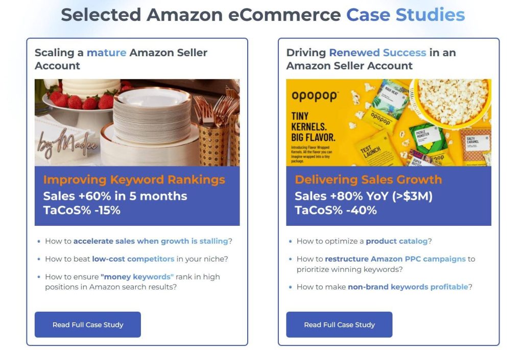
SellerMetrics, an agency specializing in helping Amazon sellers grow and optimize their performance, does this well on their homepage.
They’ve built dedicated elements that highlight individual client case studies. Each one tells what the challenge was, what they did, and what the outcome looked like. Every excerpt is tight and result-focused, with a CTA pointing to the full study.
This method allows the homepage to stay clean while the proof stays visible.

Let Customers Watch Instead of Read
Some information becomes easier to understand when users can see and hear it explained. Video gives teams a way to communicate complex ideas quickly while keeping the interface clean.
Instead of asking visitors to read dense explanations, platforms can present a short walkthrough that shows how a service works and why it matters.
User preference data supports this shift. When consumers are asked how they prefer to learn about a product or service, about 63% say they would rather watch a short video.
This preference reflects how people process information online. A brief video delivers context, tone, and explanation in a format that users can absorb quickly.
Teams can apply this tactic by outlining the most complex parts of their offer:
- Look for sections where users often ask questions or hesitate before taking action.
- Turn those explanations into short videos that focus on the practical outcome for the user.
- Keep each video concise. Most effective product explainers stay under two minutes.
- Begin with the problem the user faces.
- Follow with a simple explanation of how the service solves it.
- Close with the next step the viewer should take.
- Place the video near the relevant section of the page so users encounter it when they need clarification.
- Support the video with a short headline and one or two lines of context.
R.E. Cost Seg, a firm that helps real estate owners unlock tax savings through cost segregation analysis, puts this strategy into practice.
Their services touch on technical territory, such as depreciation schedules, IRS classifications, and tax strategy. This can lose people fast in written form.
So, instead of leaning on dense copy, they use a straightforward video that speaks directly to what property owners actually care about: saving money and understanding the process.


Turn Browsing Into Doing
Users often skim pages without taking action. Interactive elements interrupt that passive behavior and invite participation. Instead of presenting information in a fixed format, they allow brands to ask the visitor to answer questions, adjust options, or explore outcomes.
This small detail changes how people engage with a page. The experience becomes active, and users invest attention because their input shapes what they see next.
Interactive content generates about 52.6% higher engagement rates than static content. Users spend more time on the page and explore more sections because the experience responds to them. Each click, answer, or selection creates a sense of progress, which keeps people moving through the platform.
Teams can implement interactive content without rebuilding their entire platform:
- Discover which decisions users struggle to make. Product selection, pricing options, or service fit often create hesitation.
- Turn those moments into simple interactive tools. Quizzes, guided selectors, calculators, or short configuration forms work well.
- Keep the interaction focused on a clear outcome. Each question should move the user closer to a recommendation or result.
- Limit the number of steps so the experience feels quick.
- Provide feedback after each response so users understand the progress they are making.
- Design the result page carefully. Show personalized suggestions, explain why those options fit the user’s answers, and provide direct links to the next action.
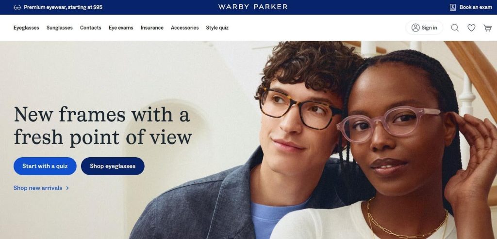
A great example here is Warby Parker, a retailer of prescription eyewear and sunglasses.
Rather than presenting users with an overwhelming catalog to scroll through, their website invites users to take a quiz right from the get-go.
Customers answer a few questions about their preferences and face shape, and the platform returns a curated selection of frames matched to their answers.
This turns a potentially frustrating browsing experience into a focused, personal one.

Final Thoughts
Each element described in this post removes friction and answers questions before confusion appears.
These improvements do not require complex redesigns. Brands can start by reviewing how their content guides users across key pages. They need to ensure that every piece of content helps visitors understand what the platform offers and what action they can take next.
When language, structure, and interface support the same goal, users stay engaged and complete tasks faster.
Platforms that treat content as a core part of UX create clearer experiences and stronger connections with their audience.
AI Agentic Platform For Building Portable AI Agents
Say Hello To Agentic AI That Connects With Your CRM And Even Other Agents